
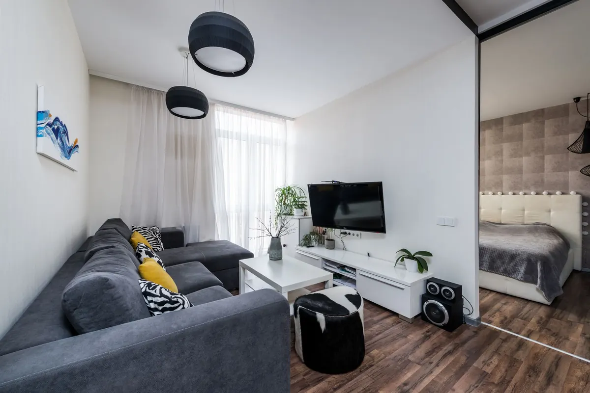


How to Mix Wood Tones in a Living Room Without It Looking Cluttered

A living room with five different wood tones rarely looks intentional. It looks like a series of good decisions that never met each other. The truth is that mixing light oak, warm walnut, and deep espresso isn't a mistake — it's a skill, and it follows a handful of reliable rules. Get those rules right and the mix becomes the most interesting thing in the room.
Here's how to bring three or four wood pieces together so they read as a considered palette instead of clutter.
Start with one dominant tone
Every successful mix has an anchor. Before you buy or move anything, decide which wood tone should be the one your eye notices first. Usually that's the largest wood surface in the room: the flooring, a big media console, a bookcase wall, or a statement coffee table.
If your floors are a mid-tone honey oak, that's your anchor whether you like it or not. Your job isn't to fight it — it's to support it. If you own almost nothing wooden yet, choose the anchor based on the mood you want. Light woods like ash, birch, and white oak feel airy and quiet. Medium tones like teak and cherry feel warm and lived-in. Dark woods like walnut and espresso add weight and drama.
Cap yourself at three tones
Three tones is the sweet spot. Four can work in a large, open room with plenty of neutral space, but beyond that the eye stops reading a pattern and starts reading noise.
Count the floor as one of your three. That leaves you two wood tones to introduce through furniture and decor, which is usually enough:
- Light oak floors + medium teak console + dark walnut side table. A classic light-to-dark progression.
- Dark floors + light ash coffee table + medium cherry shelving. The same idea, reversed.
- Medium floors + light oak + dark espresso accents. Balanced and hard to get wrong.
Undertone matters more than darkness
Two pale woods can clash badly if their undertones disagree. Ash and weathered gray oak lean cool and slightly silver. Golden oak, pine, and bamboo lean warm and yellow-orange. Cherry and mahogany lean red. Walnut leans brown with a hint of purple or gold, depending on the stain.
So when you're choosing your two supporting tones, pick them from different families but matching temperatures if you want a calm room — or deliberately contrast warm and cool if you want something more graphic. Just don't mix a cool gray-washed piece into an otherwise orange-toned room by accident. It will look like a mistake, because it is one.
Repeat every tone at least twice
A single dark piece in a light room looks lonely. Two dark pieces on opposite sides of the room look like a decision. That's the whole trick: repetition turns a coincidence into a pattern.
Small repeats count, and they're the cheapest way to fix a room. A walnut picture frame, a dark wood bowl on the coffee table, a lamp base, candle holders, the rim of a mirror. None of these cost much, and together they make the dark tone feel like it belongs. Aim for at least two appearances per tone, ideally three for the accent tone.
Let neutrals and texture do the bridging
When two woods are technically compatible but still feel tense next to each other, don't rush to paint anything. Put something in between.
A textured rug, a linen sofa, a boucle armchair, a cotton throw, a jute basket, a ceramic lamp, or a simple painted wall separates the two wood surfaces so the eye doesn't compare them directly. This is why wood tones almost never clash in well-styled rooms — there's always a soft neutral acting as a buffer.
The practical rule: don't butt two different wood tones directly against each other with nothing in between. Leave a few inches of wall, slip a cushion behind the wooden chair, or set a fabric runner under the tray.
Vary the finish as much as the color
Two pieces in nearly the same tone can still look great together if their finishes differ. A matte, raw-feeling oak and a satin-finished oak read as relatives rather than duplicates.
Matte and oiled finishes feel casual and organic. Satin sits in the middle and works almost anywhere. High gloss feels polished and formal. Try not to place two glossy pieces of similar tone side by side — the reflections multiply and the corner starts to look like a showroom. A single glossy piece surrounded by matte ones reads as a deliberate accent.
Painted wood is allowed, too. A painted console or whitewashed stool is a palate cleanser. It doesn't add a fourth tone; it gives the eye somewhere to rest.
Balance placement and scale, not just color
Once your tones are chosen, spread them across the room instead of clustering. If everything dark sits on the left wall and everything light sits on the right, the room feels lopsided even though the palette is fine.
Think in a loose triangle. Place your anchor tone in the heaviest visual spot, then distribute the two supporting tones so each one appears in at least two zones of the room — near the sofa, near the window, on the shelf, by the door. And remember contrast: light wood against a light wall can disappear, while dark wood against a dark wall can turn into a black hole. Swap them in tight corners.
A step-by-step plan you can follow this weekend
- List every wood piece. Walk the room and note each item, its tone (light, medium, dark), and its undertone (warm, red, cool, gray). Include frames, bowls, and lamp bases.
- Name your anchor. Usually the floor or the largest piece. Write it down and commit.
- Choose two supporting tones. One should sit close to the anchor in temperature; the other can contrast.
- Sort the outliers. Anything that falls outside your three tones gets moved to another room, painted, or stored. Be honest here — this step fixes most cluttered rooms.
- Add small repeats. One or two inexpensive pieces in your accent tone, placed on opposite sides of the room.
- Insert a neutral buffer wherever two woods sit directly against each other and feel tense.
- Live with it for a week before buying anything else. Wood mixes settle once you stop staring at them.
Quick fixes for the most common problems
- Everything looks orange. Add one cool-toned or gray-washed piece, plus plenty of white and cream textiles to dilute the warmth.
- The room feels heavy on one side. Move the darkest piece toward the lightest area of the room, or repeat it on the opposite side with something small.
- Two pieces fight each other. Separate them. Distance and a neutral buffer solve more clashes than refinishing does.
- A new piece doesn't fit. Check the undertone first. If it's in the wrong family, no amount of styling will hide it.
Start with what you already own
You don't need to buy a matching set or replace your furniture. Most rooms already contain the beginnings of a good palette; they just need a clear anchor, a couple of repeats, and one or two pieces removed. Work with the largest surface you can't change, build your two supporting tones around it, and let neutrals carry the rest. A mixed-wood room done this way looks collected over time rather than assembled in a single afternoon — and that's exactly the point.
Photo: bernswaelz / Pixabay